Cheat
Tailwind CSS Utility-first CSS
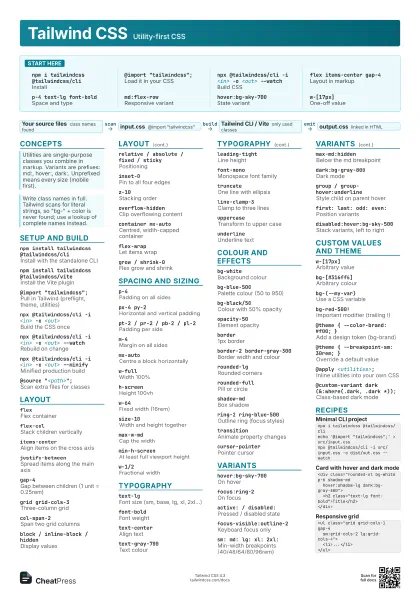
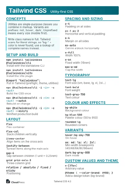 Light · Postcard
102 × 152 mm · PDF
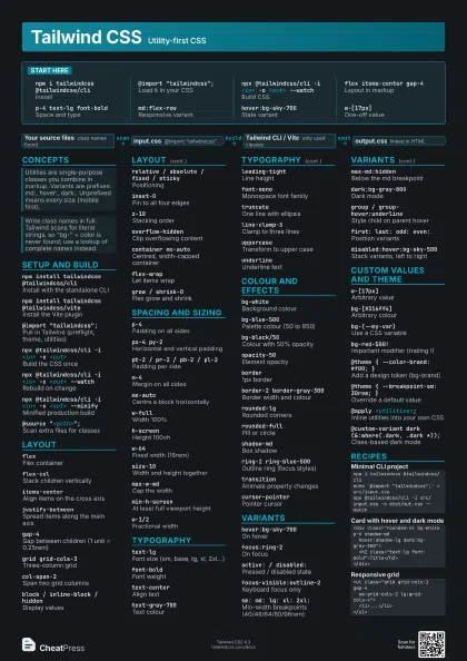
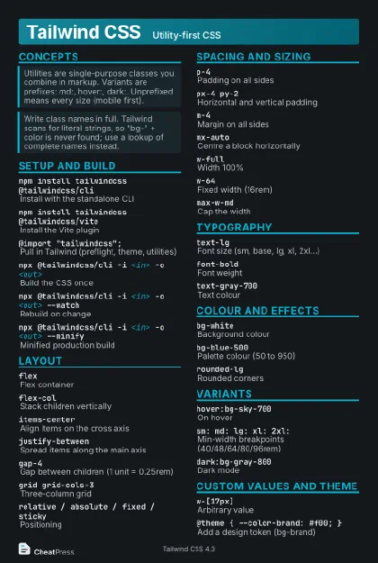 Dark · Postcard
102 × 152 mm · PDF
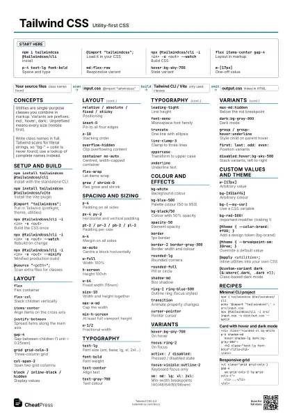
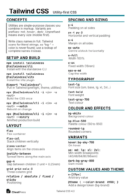 Ink saver · Postcard
102 × 152 mm · PDF
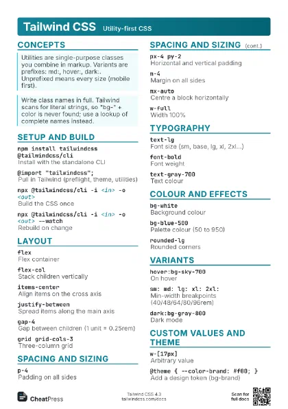
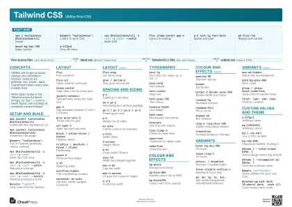
 Light · A4 landscape
297 × 210 mm · PDF
 Dark · A4 landscape
297 × 210 mm · PDF
 Ink saver · A4 landscape
297 × 210 mm · PDF
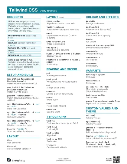
 Light · A3 landscape
420 × 297 mm · PDF
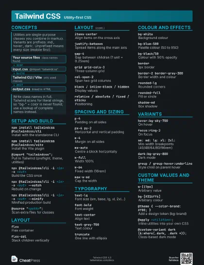
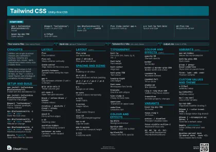 Dark · A3 landscape
420 × 297 mm · PDF
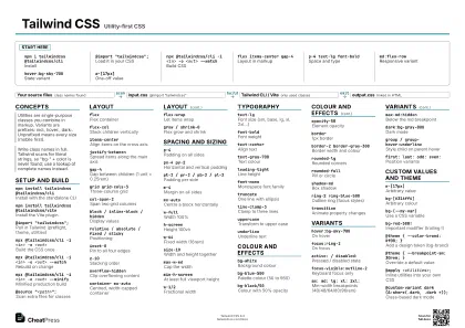 Ink saver · A3 landscape
420 × 297 mm · PDF
Start here
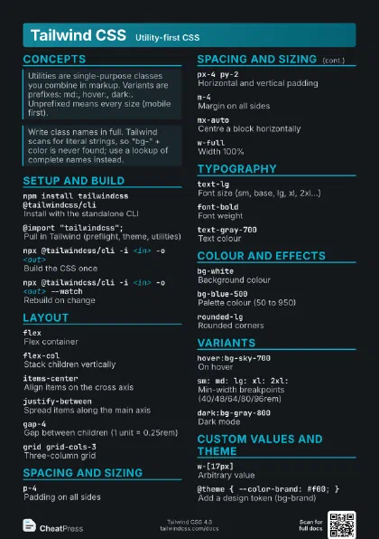
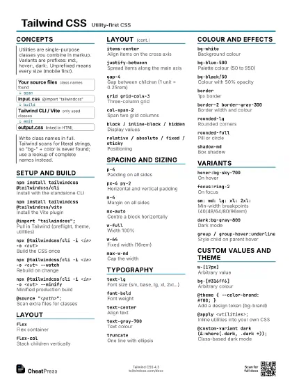
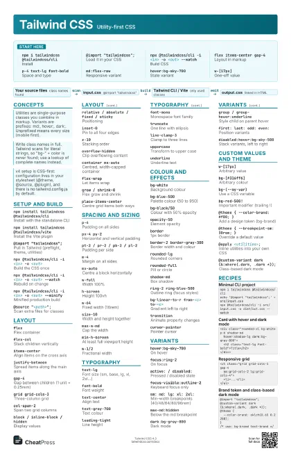
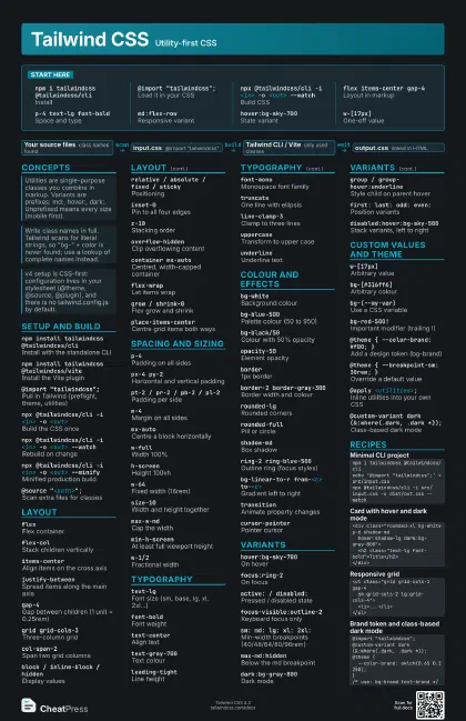
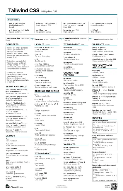
npm i tailwindcss @tailwindcss/cli
Install
@import "tailwindcss";
Load it in your CSS
npx @tailwindcss/cli -i <in> -o <out>
                    --watch
Build CSS
flex items-center gap-4
Layout in markup
p-4 text-lg font-bold
Space and type
md:flex-rowResponsive variant
hover:bg-sky-700
State variant
w-[17px]One-off value
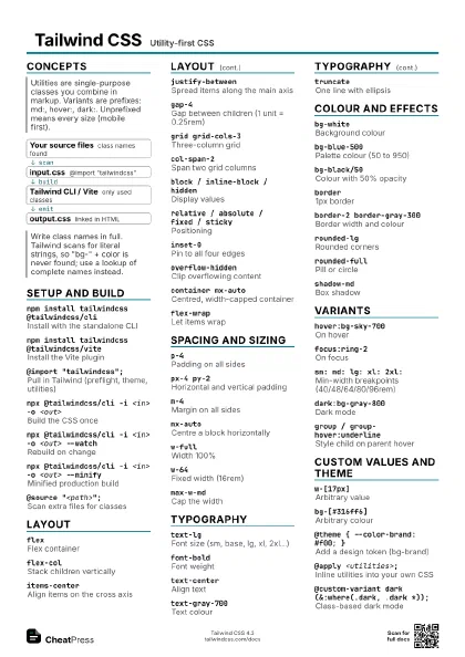
Concepts
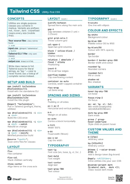
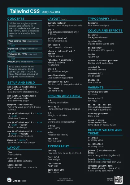
- Your source files class names found
- input.css @import "tailwindcss"
- Tailwind CLI / Vite only used classes
- output.css linked in HTML
Setup and build
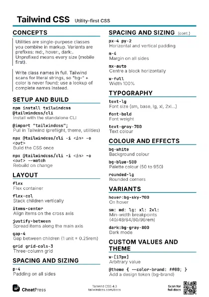
npm install tailwindcss @tailwindcss/cli
Install with the standalone CLI
npm install tailwindcss @tailwindcss/vite
Install the Vite plugin
@import "tailwindcss";
Pull in Tailwind (preflight, theme, utilities)
npx @tailwindcss/cli -i <in> -o <out>
Build the CSS once
npx @tailwindcss/cli -i <in> -o <out>
                    --watch
Rebuild on change
npx @tailwindcss/cli -i <in> -o <out>
                    --minify
Minified production build
@source "<path>";
Scan extra files for classes
@source not "<path>";
Exclude a path from scanning
@import "tailwindcss" prefix(tw);
Prefix all utilities (tw:flex)
@import "tailwindcss" important;
Mark every utility !important
Layout
flexFlex container
flex-colStack children vertically
items-centerAlign items on the cross axis
justify-betweenSpread items along the main axis
gap-4Gap between children (1 unit = 0.25rem)
grid grid-cols-3
Three-column grid
col-span-2Span two grid columns
block / inline-block / hidden
Display values
relative / absolute / fixed / sticky
Positioning
inset-0Pin to all four edges
z-10Stacking order
overflow-hiddenClip overflowing content
container mx-auto
Centred, width-capped container
flex-wrapLet items wrap
grow / shrink-0Flex grow and shrink
space-x-4Horizontal space between children
place-items-center
Centre grid items both ways
Spacing and sizing
p-4Padding on all sides
px-4 py-2Horizontal and vertical padding
pt-2 / pr-2 / pb-2 / pl-2
Padding per side
m-4Margin on all sides
mx-autoCentre a block horizontally
-mt-2Negative margin
w-fullWidth 100%
h-screenHeight 100vh
w-64Fixed width (16rem)
size-10Width and height together
max-w-mdCap the width
min-h-screenAt least full viewport height
w-1/2Fractional width
h-dvhDynamic viewport height
Typography
text-lgFont size (sm, base, lg, xl, 2xl...)
font-boldFont weight
text-centerAlign text
text-gray-700Text colour
leading-tightLine height
tracking-wideLetter spacing
font-monoMonospace font family
truncateOne line with ellipsis
line-clamp-3Clamp to three lines
uppercaseTransform to upper case
underlineUnderline text
whitespace-nowrap
Never wrap
Colour and effects
bg-whiteBackground colour
bg-blue-500Palette colour (50 to 950)
bg-black/50Colour with 50% opacity
opacity-50Element opacity
border1px border
border-2 border-gray-300
Border width and colour
rounded-lgRounded corners
rounded-fullPill or circle
shadow-mdBox shadow
ring-2 ring-blue-500
Outline ring (focus styles)
bg-linear-to-r from-<c> to-<c>
Gradient left to right
transitionAnimate property changes
duration-200Transition length in ms
blur-sm / backdrop-blur
Blur element / backdrop
cursor-pointerPointer cursor
Variants
hover:bg-sky-700
On hover
focus:ring-2On focus
active: / disabled:
Pressed / disabled state
focus-visible:outline-2
Keyboard focus only
sm: md: lg: xl: 2xl:
Min-width breakpoints (40/48/64/80/96rem)
max-md:hiddenBelow the md breakpoint
md:max-lg:flexOnly between md and lg
min-[600px]:flex
Arbitrary breakpoint
dark:bg-gray-800
Dark mode
group / group-hover:underline
Style child on parent hover
peer / peer-checked:block
Style by a sibling's state
first: last: odd: even:
Position variants
data-[state=open]:block
Match a data attribute
has-[:checked]:bg-blue-50
Style by a descendant
@container / @md:flex-row
Container query on parent width
disabled:hover:bg-sky-500
Stack variants, left to right
Custom values and theme
w-[17px]Arbitrary value
bg-[#316ff6]Arbitrary colour
grid-cols-[24rem_1fr]
Underscore stands for a space
bg-(--my-var)Use a CSS variable
[--gap:1rem]Set a CSS variable via a class
bg-red-500!Important modifier (trailing !)
@theme { --color-brand: #f00; }
Add a design token (bg-brand)
@theme { --breakpoint-sm: 30rem; }
Override a default value
@theme { --color-*: initial; }
Drop a whole namespace
@theme inline { --font-sans: var(--x); }
Token that references another variable
@apply <utilities>;
Inline utilities into your own CSS
@utility <name> { ... }
Define a custom utility
@custom-variant dark (&:where(.dark, .dark *));
Class-based dark mode
@plugin "@tailwindcss/typography";
Load a plugin
@reference "<css>";
Use theme/@apply in a Vue/Svelte style block
@layer components { ... }
Put custom CSS in a layer
Recipes
npm i tailwindcss @tailwindcss/cliecho '@import "tailwindcss";' > src/input.cssnpx @tailwindcss/cli -i src/input.css -o dist/out.css --watch<div class="rounded-xl bg-white p-6 shadow-md hover:shadow-lg dark:bg-gray-800"> <h2 class="text-lg font-bold">Title</h2></div><ul class="grid grid-cols-1 gap-4 sm:grid-cols-2 lg:grid-cols-4"> <li>...</li></ul>@import "tailwindcss";@custom-variant dark (&:where(.dark, .dark *));@theme { --color-brand: oklch(0.65 0.2 250);}/* use: bg-brand text-brand */